Work
Three iOS apps we designed and built, and a Shopify store we customized and run. The apps started as design systems before they were screens — color, type, and spacing decided up front so each stayed coherent as it grew.
MetconRX
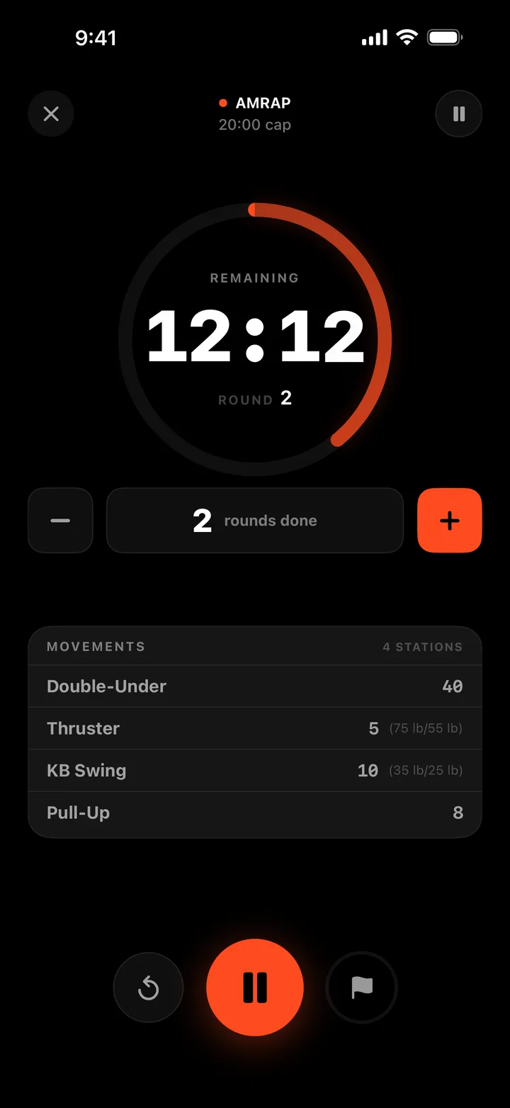
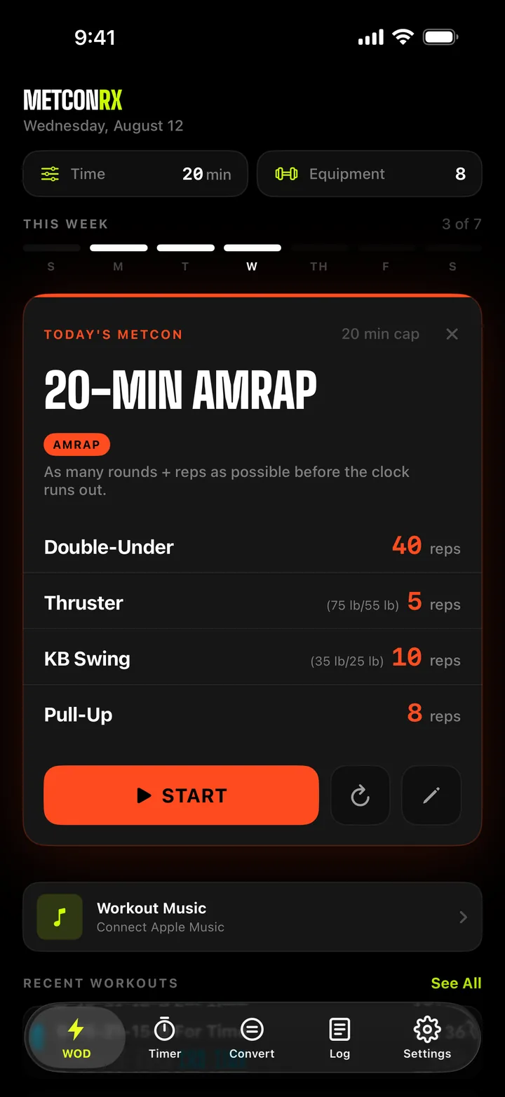
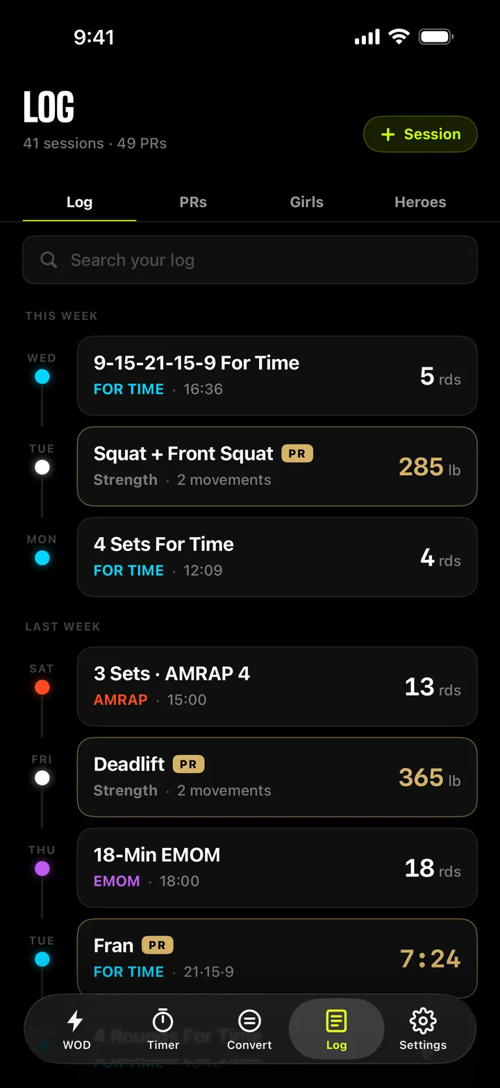
A functional fitness app that writes the workout, times it, and tracks every PR — designed and built by us, start to finish. It’s made to be read at a glance mid-workout: big type, a color for each workout format, and one obvious next step on every screen.
Read the case study →Deep Work
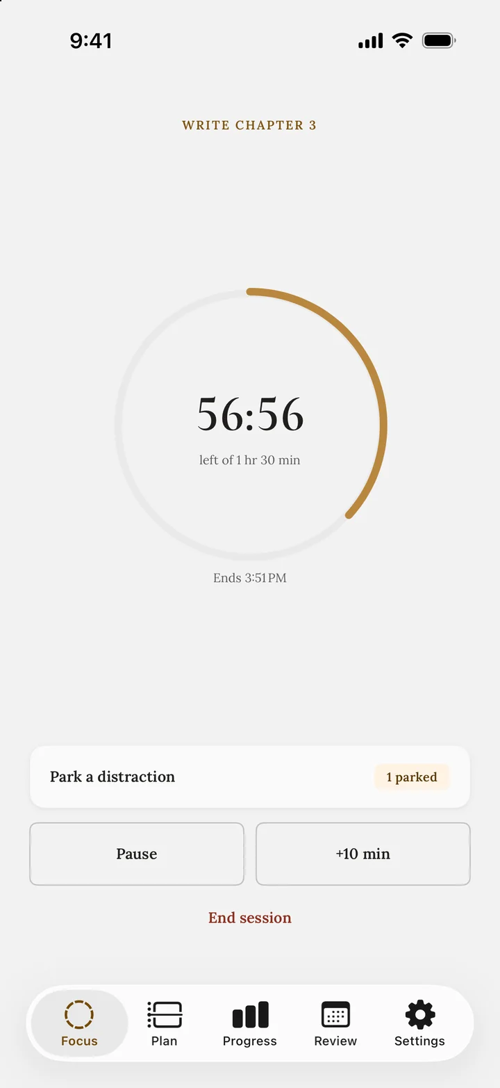
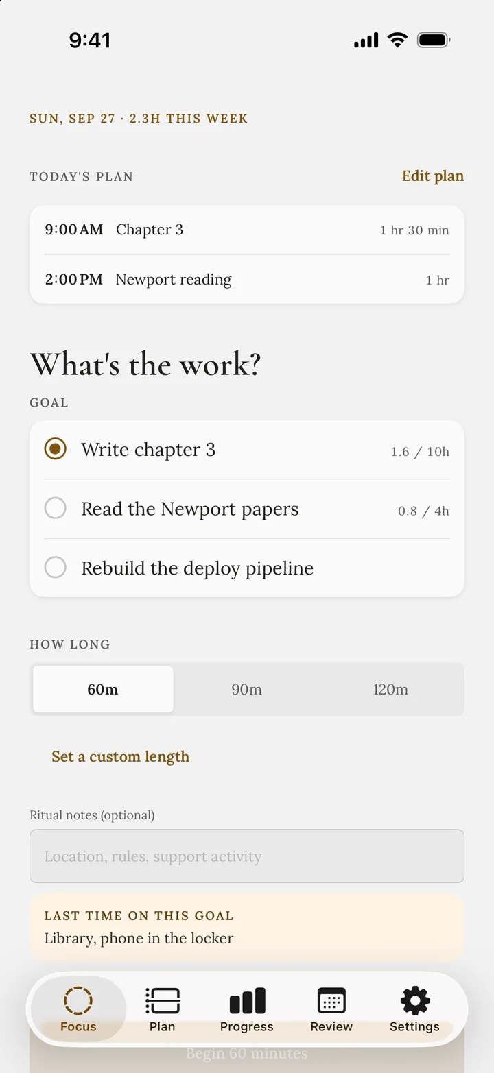
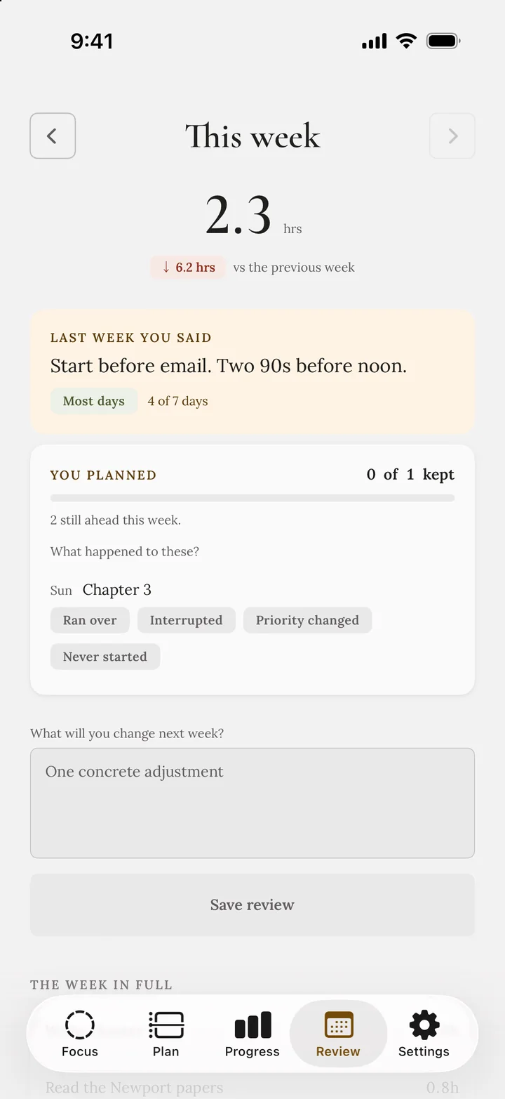
Focus sessions, time-block planning, and a weekly review. The brief was an app that didn't feel like productivity software — so the type system is a display serif over a book serif, the palette is paper and gold, and there isn't a streak counter anywhere.
Recite
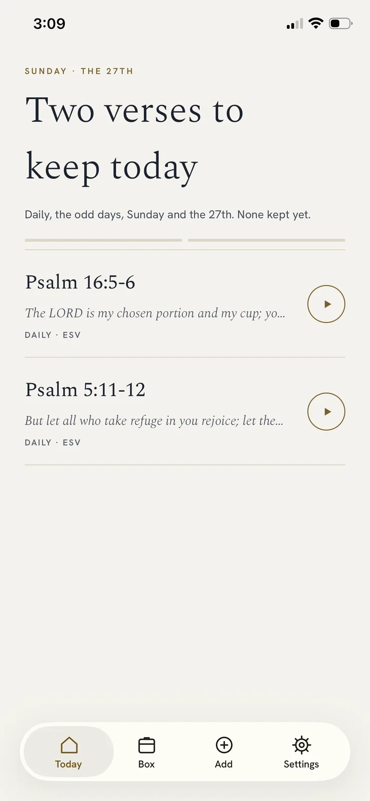
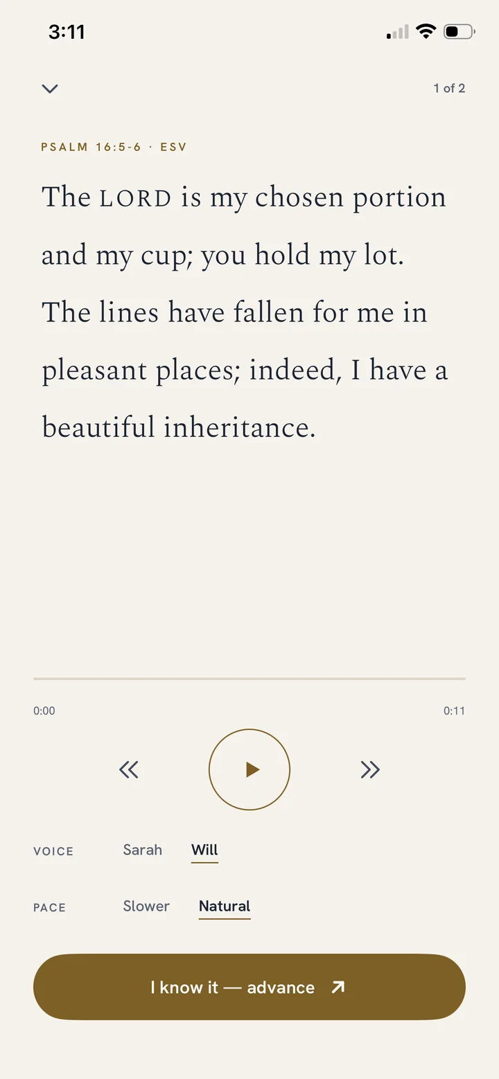
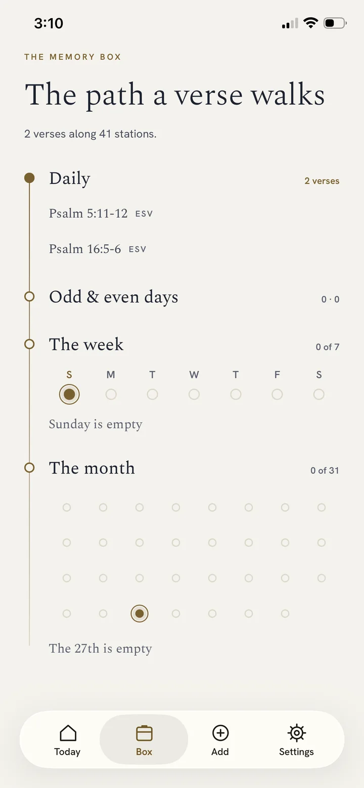
Scripture memorization on a spaced-repetition schedule, with audio recitation in a choice of voices and paces. Paper tones, a single gold accent, and serif type set like a well-made book — in light and dark mode.
Caitlin Joy Art
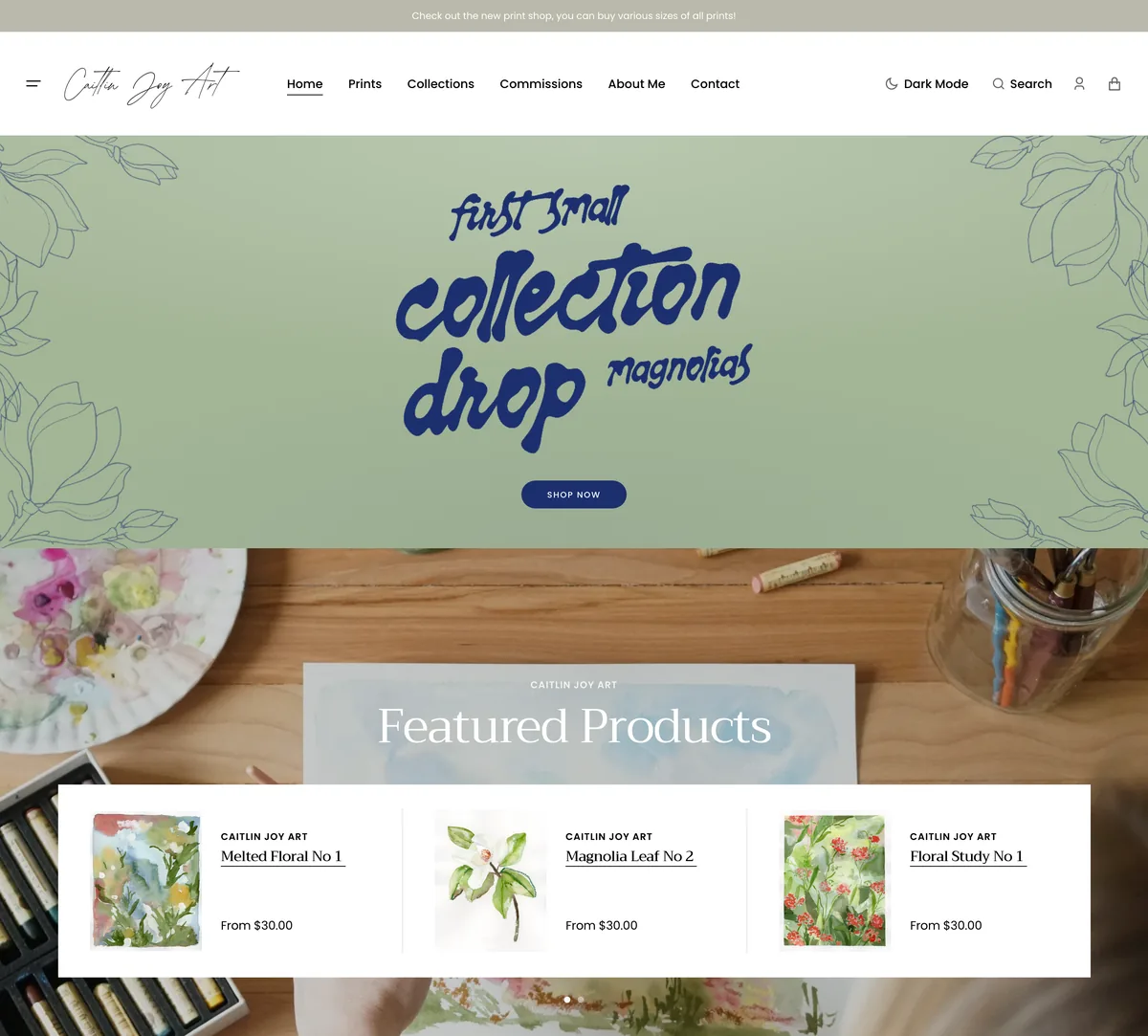
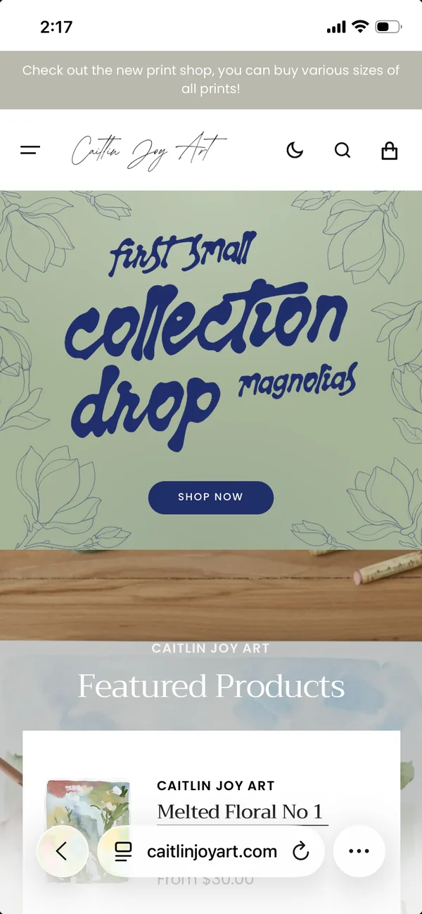
An online store for a watercolor artist’s originals and prints. We customized the Shopify theme and built the first small-collection drop — a custom hero, a dedicated collection template, and eight originals set up and launched — and we keep the store running day to day.
Visit the store ↗